Culinary Color Psychology: How Food Hues Influence Our Appetite
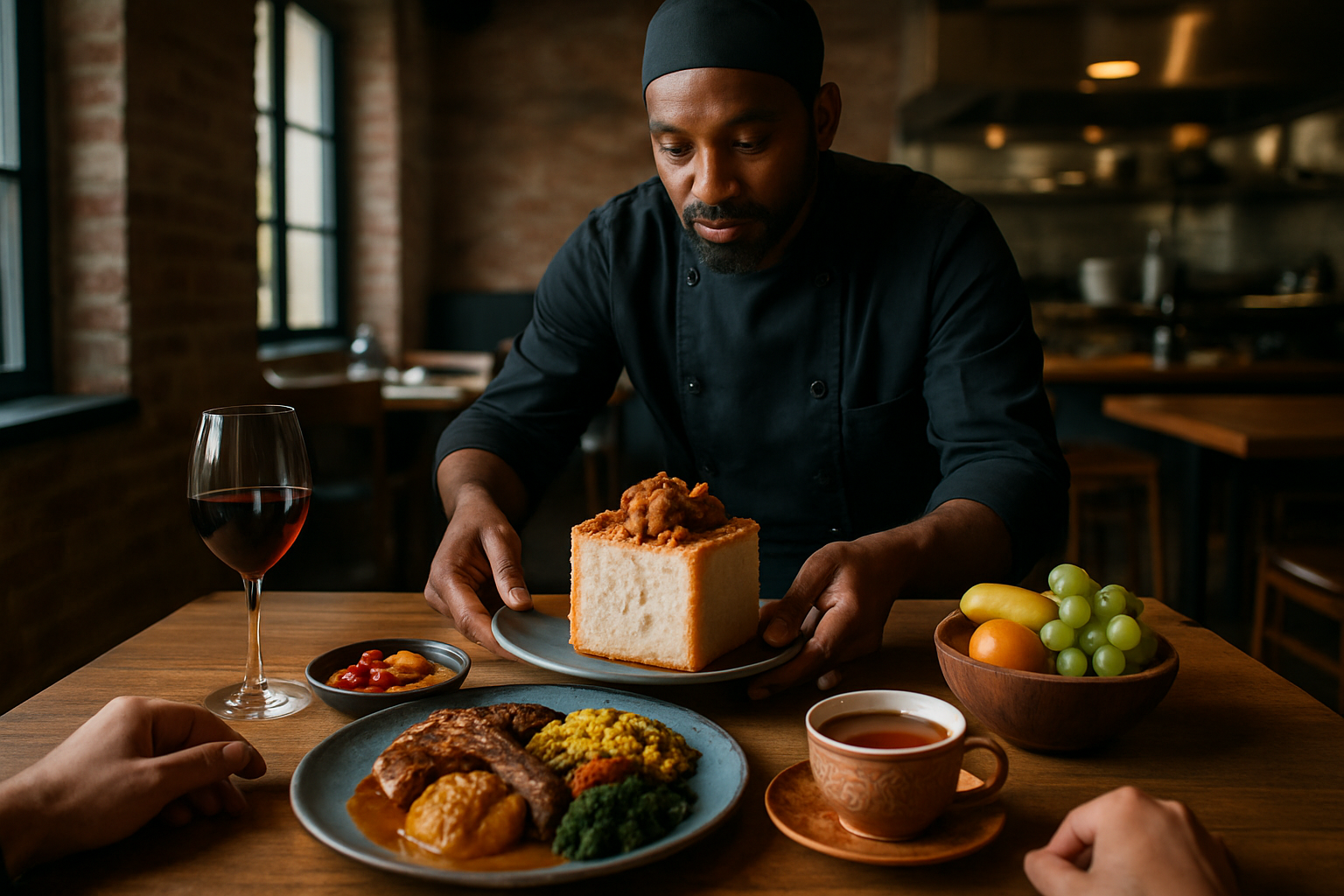
Vibrant red tomatoes, lush green herbs, golden honey drizzling over fresh bread – the color spectrum of our meals does more than please the eye. Recent gastronomy research reveals that the visual palette of our food profoundly impacts our eating experience, influencing everything from perceived flavor to portion control. This fascinating intersection of neuroscience and culinary arts is transforming how chefs plate dishes and how home cooks approach meal presentation. Understanding the psychology behind food colors opens a new dimension to cooking that goes beyond taste and texture.

The Science Behind Color’s Influence on Taste
The human brain processes visual information before our taste buds even register flavor. When we see a bright yellow lemon, our brain immediately prepares for sourness – a phenomenon called “sensory expectation.” This neurological response explains why artificially colored foods can trick our perception, like when blue potato chips taste “wrong” despite having identical flavors to their traditionally colored counterparts. Studies conducted at Oxford University’s Crossmodal Research Laboratory have demonstrated that changing a food’s color can alter taste perception by up to 20%, with participants consistently reporting different flavor profiles based solely on visual cues.
The connection goes deeper than learned associations. Our evolutionary history programmed specific responses to certain food colors – red and orange fruits signaled ripeness and nutritional value, while unusual colors like blue (rare in nature) triggered caution. These instinctual reactions persist in modern dining experiences. Chefs leverage this knowledge when designing dishes, using color not just for aesthetic appeal but as an actual flavor enhancer. For example, plating strawberry desserts on white dishes intensifies sweetness perception, while serving the same dish on black plates can make it taste richer and more complex.
Red and Yellow: The Appetite Stimulators
Have you ever wondered why fast-food chains predominantly use red and yellow in their logos and restaurant designs? These colors aren’t randomly chosen – they’re strategic appetite triggers. Red stimulates hunger by increasing heart rate, blood pressure, and creating a sense of urgency. Yellow evokes feelings of happiness and optimism while capturing attention more quickly than any other color. Together, they create a powerful psychological combination that encourages quick decision-making and increased consumption.
This effect extends beyond restaurant marketing into everyday cooking. Red-hued foods like tomatoes, red meat, and strawberries generally receive higher flavor ratings in blind taste tests when their color is visible. Yellow foods are consistently perceived as more satisfying and comforting. Home cooks can apply this knowledge by incorporating these stimulating colors into meals when serving people with reduced appetites, such as elderly family members or those recovering from illness. Conversely, those watching their portion control might benefit from serving meals on blue plates or using cooler color schemes in their dining areas, as these hues naturally suppress appetite by creating psychological distance from the food.
How Blue and Purple Affect Eating Behavior
While red and yellow stimulate eating, blue acts as nature’s appetite suppressant. Blue foods are exceedingly rare in nature, with blueberries and certain varieties of potatoes being notable exceptions. Our ancestral programming reads blue as potentially dangerous – historically, blue, black, and purple often signaled spoilage or poison. Modern research confirms that blue environments and tableware reduce food consumption, with some studies showing up to 33% less intake when dining with blue plates or under blue lighting.
This counterintuitive effect has practical applications in contemporary nutrition and wellness. Weight management programs sometimes recommend blue light in refrigerators or blue plates to subtly discourage overeating. Conversely, care facilities for patients with dementia or eating disorders often avoid blue tableware when trying to increase food consumption. Purple foods present an interesting exception – while technically in the appetite-suppressing color spectrum, their growing association with antioxidants and health benefits has created a positive psychological association that can overcome the inherent appetite-suppressing quality. Purple cabbage, eggplant, and berries have become visual signifiers of nutritional value, demonstrating how cultural learning can reshape our instinctual responses to food colors over time.
Color Contrast: The Chef’s Secret Weapon
Professional chefs have long understood that visual contrast dramatically enhances perceived flavor intensity. This technique, now backed by neurogastronomy research, explains why a perfectly seared steak looks more appetizing against creamy white potatoes, and why desserts often feature complementary color garnishes. The scientific principle behind this is sensory-specific satiety – our brains (and taste buds) fatigue when experiencing uniform stimuli but remain engaged when presented with variety.
Creating strategic color contrasts involves understanding color wheel basics applied to food. Complementary colors (those opposite each other on the color wheel) create maximum visual impact – think green herbs sprinkled over orange squash soup or purple berry compote against yellow custard. Beyond aesthetics, this practice enhances flavor perception by creating neurological anticipation and preventing sensory fatigue during the meal. Home cooks can easily adopt this technique by thinking beyond traditional garnishes and considering the plate as a canvas for color composition. Even simple meals benefit from thoughtful color additions – a sprinkle of paprika on deviled eggs or fresh herbs across pasta creates visual appeal that translates to enhanced flavor perception without changing the actual taste components.
Cultural Differences in Color Perception
Our color associations with food are not universal but deeply influenced by cultural context. Western consumers typically expect vanilla ice cream to be white or pale yellow, while in many Asian countries, vanilla flavoring might appear in green ice cream without causing confusion. These cultural differences extend beyond expectations to actual taste experiences, with studies showing that people from different cultural backgrounds literally taste the same foods differently based on their color-flavor associations.
The globalization of cuisine continues to reshape these color expectations. Foods once considered strange due to unfamiliar coloration – like purple yams, black rice, or blue corn – have gained acceptance as international cuisines become mainstream. Modern food culture increasingly celebrates vibrant, Instagram-worthy presentations, pushing chefs to experiment with unexpected color combinations and naturally colorful ingredients like butterfly pea flower tea (which changes from blue to purple) or activated charcoal (creating striking black foods). Understanding how different cultures interpret food colors allows both professional and home cooks to play with expectations, either conforming to traditional associations for comfort or deliberately subverting them for surprise and delight.
Practical Color Psychology Tips for Home Cooks
-
Serve food that needs to be eaten hot on warm-colored plates (red, orange) as these colors are psychologically associated with warmth and can make food seem warmer.
-
Use blue or green plates for salads and healthy options to enhance the perception of freshness and healthfulness.
-
Add a pop of contrasting color to monochromatic dishes – like black sesame seeds on white rice or red berries on vanilla ice cream – to increase perceived flavor complexity.
-
When serving children new vegetables, consider pairing them with naturally colorful dips or arranging them in rainbow patterns to increase acceptance.
-
Create visual appetite control by using smaller blue or black plates for portion management.
-
For dinner parties, choose plate colors that complement your food – white plates make small portions appear larger while dark plates make rich foods seem more indulgent.
-
Incorporate at least three different food colors in main meals to increase perception of variety and nutritional value.
-
When cooking for someone with diminished appetite, serve food on red or orange plates and avoid blue elements in the dining environment.
-
Use color strategically in food photography by understanding which colors advance (warm) and which recede (cool) visually.
Food color psychology represents a fascinating frontier where culinary arts meet cognitive science. By understanding how different hues influence our perception and appetite, we can transform everyday cooking from mere sustenance to a multi-sensory experience. Whether you’re plating a gourmet meal or arranging a simple lunch, thoughtful color choices enhance both the visual appeal and the perceived flavor of your food. The next time you prepare a meal, consider not just how it will taste, but how its colors will speak to the brain before the first bite ever reaches the tongue.


